Craig Ford’s Fine-Art Blog
A multi-disciplinary, pop-art post-modern artist
Another sketchbook drawing
Monday, November 1, 2010
I probably should have done a better job of scanning this in, as a bit of the left page’s left edge got cropped off, but here’s another example of my sketchbook diary series. It really wasn’t intended a series, but as happens when you have a sketchbook and you’re sitting around your apartment. So you start to draw what is in front of you, and it becomes a sort of diary or document of what life was like at that particular moment. I seem to recall using some sort of fountain pen that really didn’t allow for much variation in line width, so I just kept to the contour of all the objects. At the time I didn’t really care for the sketch, but in hindsight its more accurate to all the things that were in that room. Anyway, from humble beginnings, blah blah blah.
Romulus & Remus
Tuesday, October 12, 2010
One of my first patrons, I know that sounds pretentious but this lady claimed to actually like what I painted, noticed that several of my works had figures wearing sunglasses. She had photographed her son wearing these oversized shades, he had an odd little build and the sunglasses just made the image look stranger. She had also photographed her boy in a series of snapshots from the backdoor to poolside. So combining a couple of the images and you have twins. And taking a name from Roman mythology’s best loved twin boys, I think it makes an interesting composition. I added the undersea plant life on the left and right sides.

28″ x 28″ oil on canvas
Like a reptile sunning itself…
Tuesday, October 12, 2010
Back in the day of my higher education, before melanoma was a topic of conversation amongst my peers, a one time friend had climbed up on a concrete slab roof to attempt darkening his pigment for mating ritual purposes. I had gone atop said roof to get a better view to draw a landscape. Instead, this guy had sprawled in front of me so I drew him in my sketchbook. 
Had to quickly draw this guy as the concrete was a bit hotter then bare skin desired; sort of the worm in a frying pan syndrome. But I actually was able to get a decent likeness.
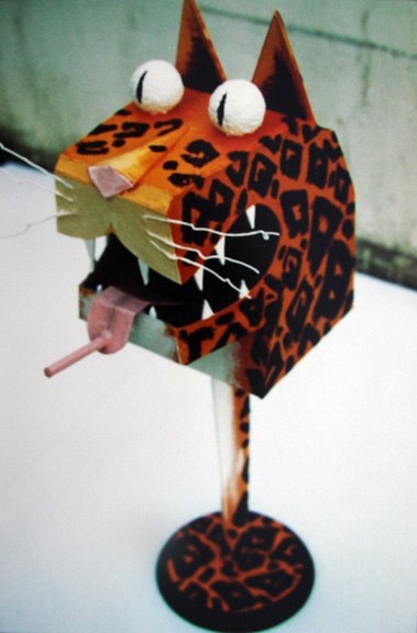
Cat Birdhouse
Wednesday, October 6, 2010
Years ago here in Atlanta, Habitat for Humanity – the organization that builds houses for families who are unable to get into homeownership thru traditional methods. And I’m not taking about the predatory financial lenders that have wrought havoc to the current climate. But I digress. So to help raise money for the house building materials, a bird house auction was held. Several local artists and creative organizations were asked to participate by making an artistic bird house. The bird houses could be functional but not a requirement.
sold
So taking a black humor approach, I thought it might be fun to make a bird house where the bird would nest/exist inside the jaws of a cat. I went with tiger colors and a leopard pattern.
I wasn’t at the actual auction but I hear that there were a couple of bidders who went back and forth for a bit before it was finally sold. Hopefully it paid for a hammer and nails.
portrait of Bob, 1985
Sunday, September 26, 2010
A companion piece to the “portrait of Mae, 1985”, is this 16”x 20” oil of Bob Fogg. My rational for this painting is the same as described in my blog entry below this one. This too was referenced from a snap shot I took one morning on a Florida beach. The actual image had some high contrasting shadows
that I softened to reveal more definition in the face. This was particularly true for the eyes being seen through the sunglasses.
A number of my paintings of figures in the bright coastal sun have dark sunglasses, which add a slight mystery to the person in the picture. But since this was a actual portrait, I painted what the human eye could see, not the camera, to capture the subject’s likeness.

not for sale
Adirondack Chair
Sunday, September 26, 2010
With an obvious name like Adirondack Chair, is this outdoor furniture advertising? Not so, unless that’s what you want it to be. My question is who’s missing from the chair? Who’s suppose to be residing there subjects? I don’t have an answer, but that’s what I wondered. Unless the chair was some sort of trophy, some object of material hierarchy that induces a sense of pride so its given a priority to be before it’s subjects. Or is it something to hide behind even though you’re posing for you’re portrait. What do you think?

18″x 20″ oil on canvas SOLD
Holiday
Sunday, September 26, 2010
This is an old water color I did some time ago that was the basis for the “Disneyland Purgatory” oil painting found in this blog.

not for sale
It started out as an assignment in the category of “how I spent my summer vacation concept” and I found this image to be an ideal subject. After I did the watercolor, I always thought that I’d go back and re-do this in another medium one day.
Three Brothers
Sunday, September 26, 2010
This painting isn’t so much a portrait of these three men so much as its a composition of three figures placed in a square shape. The lines of the shadows and the underside of the vehicle provide a perspective that keeps the background from being a flat backdrop. The representation of the figures has a more “mural-esque” styling (I kept thinking about the WPA art that was created back in the 1930s) that suggests a concept without telling a specific story. Based on a small, B&W photo some 60 years ago, I kept the most interesting elements to make this painting.

36″x 36″ oil on canvas
sketchbook drawing
Sunday, September 26, 2010
Did this drawing on a cold winter day in LaGrange, GA. I was sitting at a table in an over the garage “room for rent” apartment. Its not a great drawing, but I’ve always liked the feeling of space I think I captured. This one goes across the book’s spine for a two page spread.

sketchbook drawing
NFS
Disneyland Purgatory
Monday, August 30, 2010
This is a “tiled canvas” sort of thing. Meaning that each of the 6”x 6” squares below, spaced 1” apart, were painted separately. The small watercolor in the upper right hand corner was the first painting I did of this subject, which reminded me of a Diane Arbus photo but in color.
But the image of a small kid with black bars separating him from a floral garden in a place for the whole family seemed to have a certain irony. After I painted a small watercolor, I thought about translating the image to an oil painting. At first I was going to start using several irregular shaped canvasses, leftovers basically, to paint this. However I realized the overall size would be too large to logistically tile these. So after a while I decided on using the smaller, evenly shaped square canvasses worked best.

30″x 30″ oil on canvas tiles
After painting all 25 tiles, it was the consensus to keep an inch of space between the canvas tiles instead of piecing it all together. Anyway, above is the final work.
