Craig Ford’s Fine-Art Blog
A multi-disciplinary, pop-art post-modern artist
Jasper – a pet portrait
September 27, 2014
And here’s the approved version…
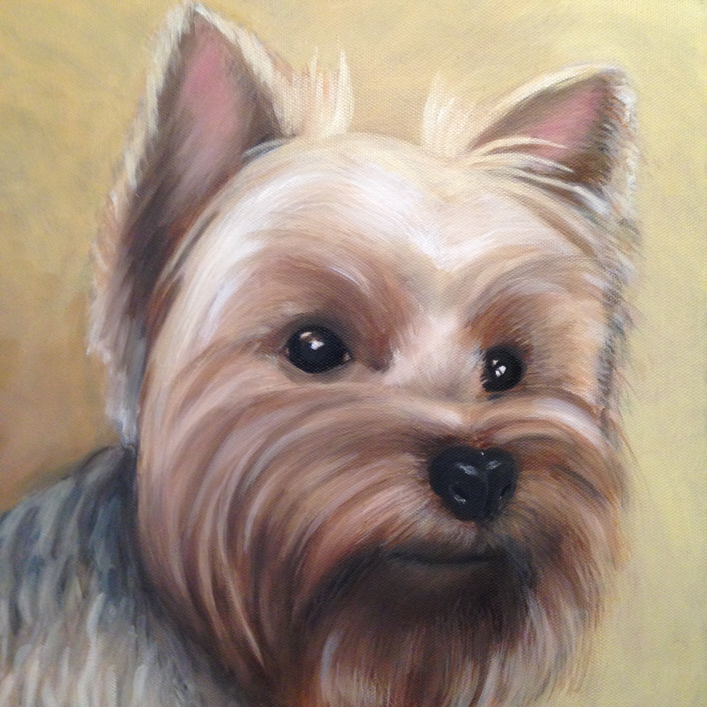
12″ x 12″ oil on canvas – SOLD
Jasper’s portrait
September 21, 2014

12″ x 12″ pencil sketch
I guess I’ll be putting the still life paintings on hold for a moment so I can produce some commission work. And one of the commissions that I enjoy creating are pet portraits. I’m a fan of dogs and cats, so I like painting their fuzzy faces when I get a chance. And before I start painting, I do pencil sketches to figure out the light, the texture, the composition and to get an approval before the paint hits the canvas. So I might try posting progressions of this portrait so you can see how tho goes from pencil to a finished portrait. Below is the sketch, done at the actual size of the canvas I’ll be working on. Once I have a drawing nailed down, I use it to transfer the basic proportions to the canvas mainly so I can duplicate the approved version. So check back in a few days and let’s see where this goes.
Painterly light bulbs
September 19, 2014
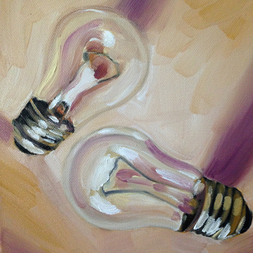
8″ x 8″ oil on canvas
8″ x 8″ oil on canvas

8″ x 8″ oil on canvas
I’m trying to paint clear glass objects on a beige colored surface, and I need to find some color in very colorless objects. There is a slight bit of light that has reflected off of nearby surfaces that suggest warm tones. So as I paint I exaggerate these tones to play up parts of the composition, while also keeping a more lush brushstroke then I usually have. This helps to activate areas that only have subtle shadows at best to define that space around the lightbulbs. This starts to go in a direction quite different then what I’ve been doing, I may continue in this direction if it suits the objects I’m painting. What do you think? As always, please feel free to comment. This is available for purchase at http://www.atlantaartistcollective.org.
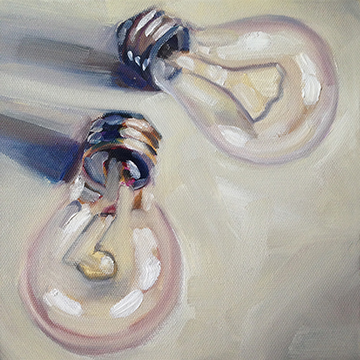
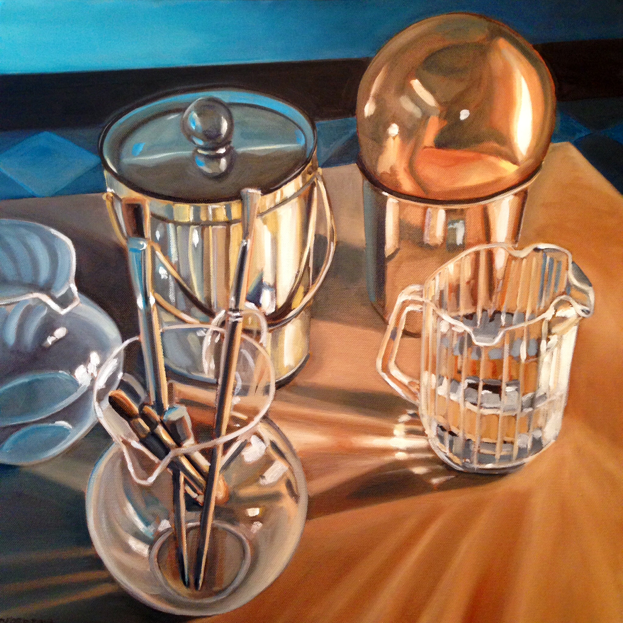
Some lightbulb still-life art
September 15, 2014

8″ x 8″ oil painting SOLD

8″ x 8″ oil painting. SOLD
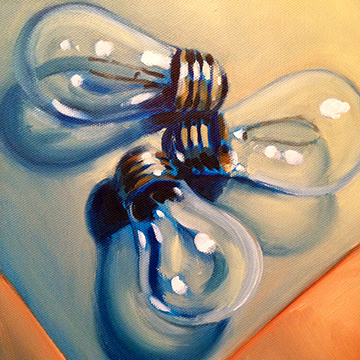
8″ x 8″ oil painting, SOLD
In keeping with painting a still life that has shinny translucent parts, I started working on these small paintings. Having a lot of fun doing these and it goes pretty quickly getting them down on the canvas. I have two more sets of three to do then I’ll move on to another subject. Let me know what you think of these.
Still Life #17
September 2, 2014
20″ x 20″ oil painting
20″ x 20″ oil painting
Here’s a painting completed after many interruptions, stops and starts, and while I was running a fever from a late summer cold that I caught. Now I’m starting to second guess the colors I used, was it the fever? Was it the cold medicine? Or all of the above? Or is the color OK? If I make a change I’ll note it here in the blog text. In the meantime any comments anyone has is always welcomed.
painted self-portrait
August 24, 2014

8″ x 10″ oil on canvas board
Not much to say here. I think this is my first painted self portrait, I usually do this sort of thing in a sketchbook in pencil or ink. I’d been asked to produce a painted “selfie” for potential online art gallery so here’s what I knocked out. Its an oil painting but was done in a more watercolor treatment of the pigment, i.e. a series of color washes to define the form. And its pretty small from what I usually do with the brushes I work best with. But if there was any wonder what I look like, your question is answered.
Still Life #16
August 10, 2014

20″ x 20″ oil painting SOLD
After that last formal and more traditional looking still life (which I guess I needed to get out of my system so I can say ‘been there done that’), I returned to what I think is a more dramatic presentation of these still life items. As previously mentioned, I find cropping objects close to the edge makes for a more dynamic composition. Or at least that’s my opinion, I know there are professional still life artists who would completely disagree with that statement but it seems to be working for me.
Still Life #15
July 29, 2114
20″ x 20″ oil painting
With this still life, I opted to go a more traditional composition route. I usually don’t care for this more static approach and probably won’t go down this path again. Not that its wrong, I just don’t prefer this type of presentation of the subject matter. I think when you crop portions of the still life off the edge of the picture plain it creates more tension or movement to the painting. The next one will be much more “close cropped” of the objects.
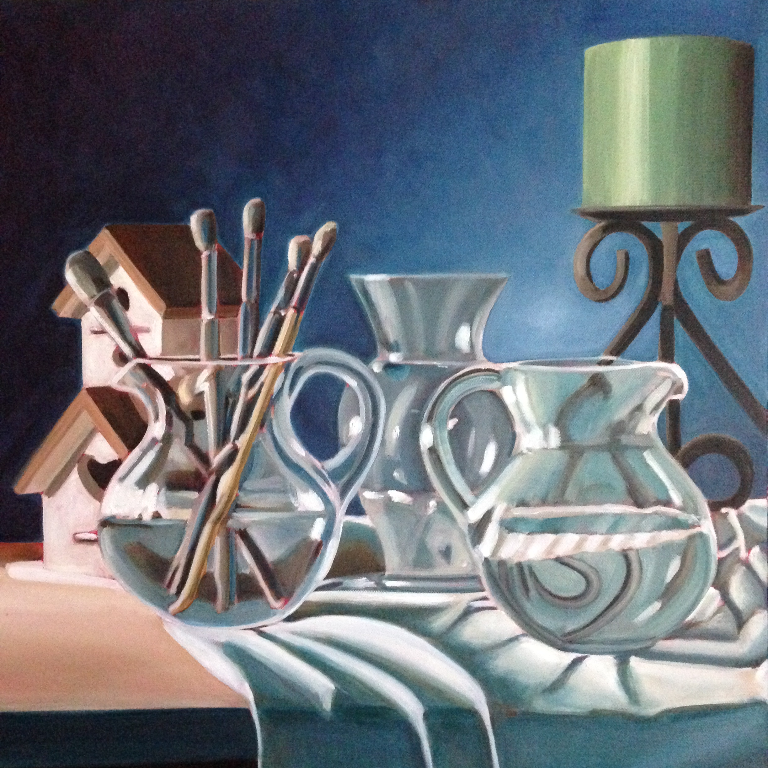
Still Life #14
July 19, 2014
20″ x 20″ oil painting SOLD
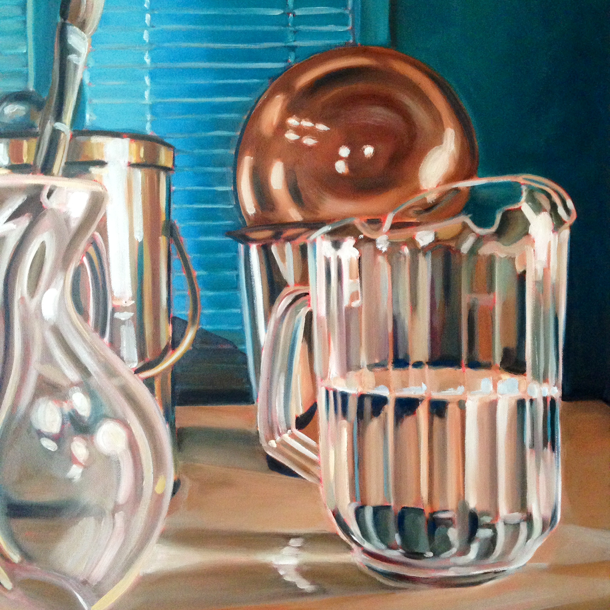
Here’s another still life. This is similar to Still Life #7 in the combination and position of objects, it’s a slightly different scale and angle. I wanted to try and get the “scattering” of light that is reflected off of the segmented pitcher, which acts like a series of prisms deflecting light in multiple directions. I think I like capturing the objects larger in this canvas size format, but I do like the variety it offers to this series.
Still Life #13
July 3, 2014

20″ x 20″ oil painting
Here’s another canvas with a red underpainting, offers a glimpse of the red in areas where the paint strokes don’t butt up next to one another. The red also warms up the color on top of it in ways that I don’t always know how it will look once the top paint begins to dry. Some of the colors get a bit redder or start to appear violet but it never disappoints, it often alters the color palette in a positive manner that I wouldn’t have thought doing.
