Craig Ford’s Fine-Art Blog
A multi-disciplinary, pop-art post-modern artist
Lite Decaf
December 1, 2014
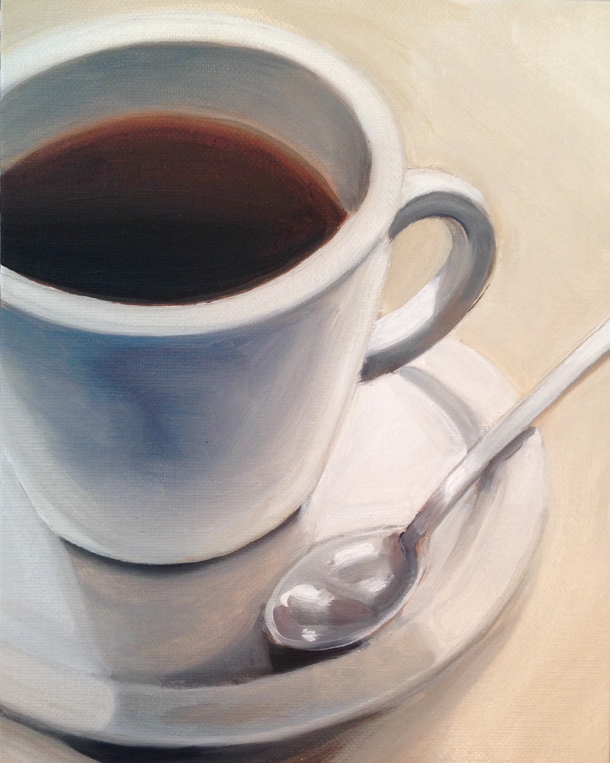
8″ x 10″ oil on canvas – sold
Monochromatic color scheme. This small painting can be obtained at atlantaartistcollective.com if you want to own it. This is available for purchase at http://www.atlantaartistcollective.org.
RGB Bottles
November 20, 2014

10″ x 10″ oil on canvas, SOLD
Getting back to some basics, here’s the multicolored bottles in a different arrangement. Being a fan of painter Wayne Theibaud’s still lives, I attempted a similar compositional style. And I still have a lot to learn on how he can make something look so simple until you try it and realize Mr. Theibaud has more going on then initially meets the eye.
Hommage to Hockney
November 17, 2014
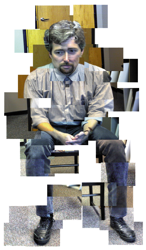
photo collage
While I’m still working on several oil paintings to be posted here in the very near future, thought I’d post this self portrait that was done some 17 years ago. I was employed at this ad agency and a client, Sony, had just come out with what was at the time a fairly new device, a high end digital camera for consumers. Naturally the art department got a chance to play with this “new toy”. Being a fan of the UK artist David Hockney, I thought this new digital medium would be a great way attempt emulating one of Hockney’s photo-collages in a technique he called “joiners”. This was his way of express the cubism technique that had been use in painting for decades through the medium of photography. But where as Hockney had shot several rolls of film and then had to send those rolls of film off to the lab to be developed and printed, you could point shoot and a few seconds later download that photo to one’s computer ready to use. So I got the senior art director, who was the main art department individual playing with this new camera, to click off about several dozen shots of various parts of me sitting in a chair in his office. After about all of five minutes, the images were copied over to my desktop. I picked out just the images I needed, not every one was worth using, just enough to construct a necessary suggestion of form. But I’m not going to go all into the theory of cubism and its application, just Goggle Hockney’s photography to see and discover what that was all about. I was trying out his technique to see if I could get it.
Evee
updated November 18, 2014
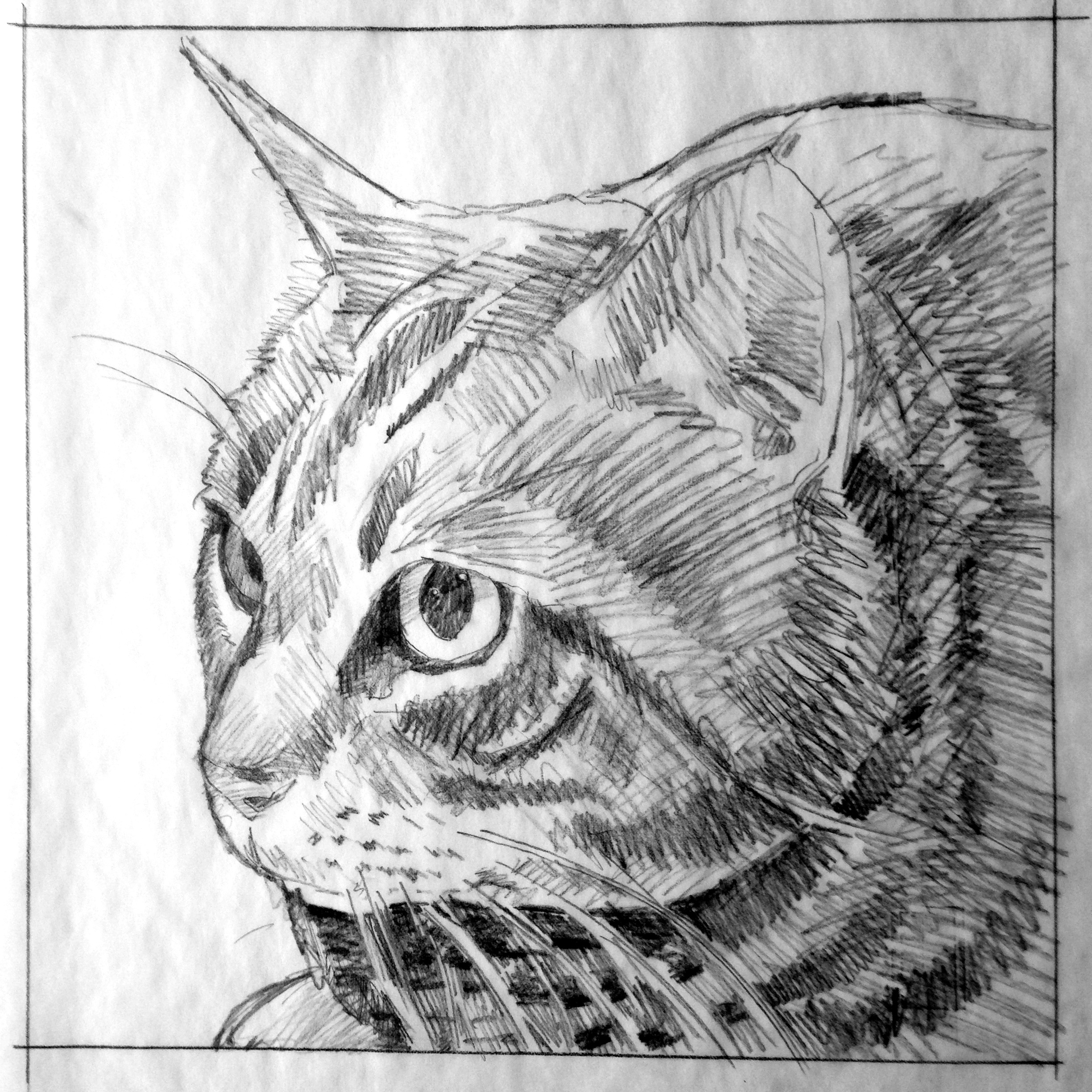
12″ x 12″ pencil drawing
Got another pet portrait commission for a grey tabby cat named Evee. I’ve worked up a pencil sketch, based on some photos sent to me, for approval before the actual painting is started. Once I get a “green light” from the patron, then I begin working on the painted portrait.
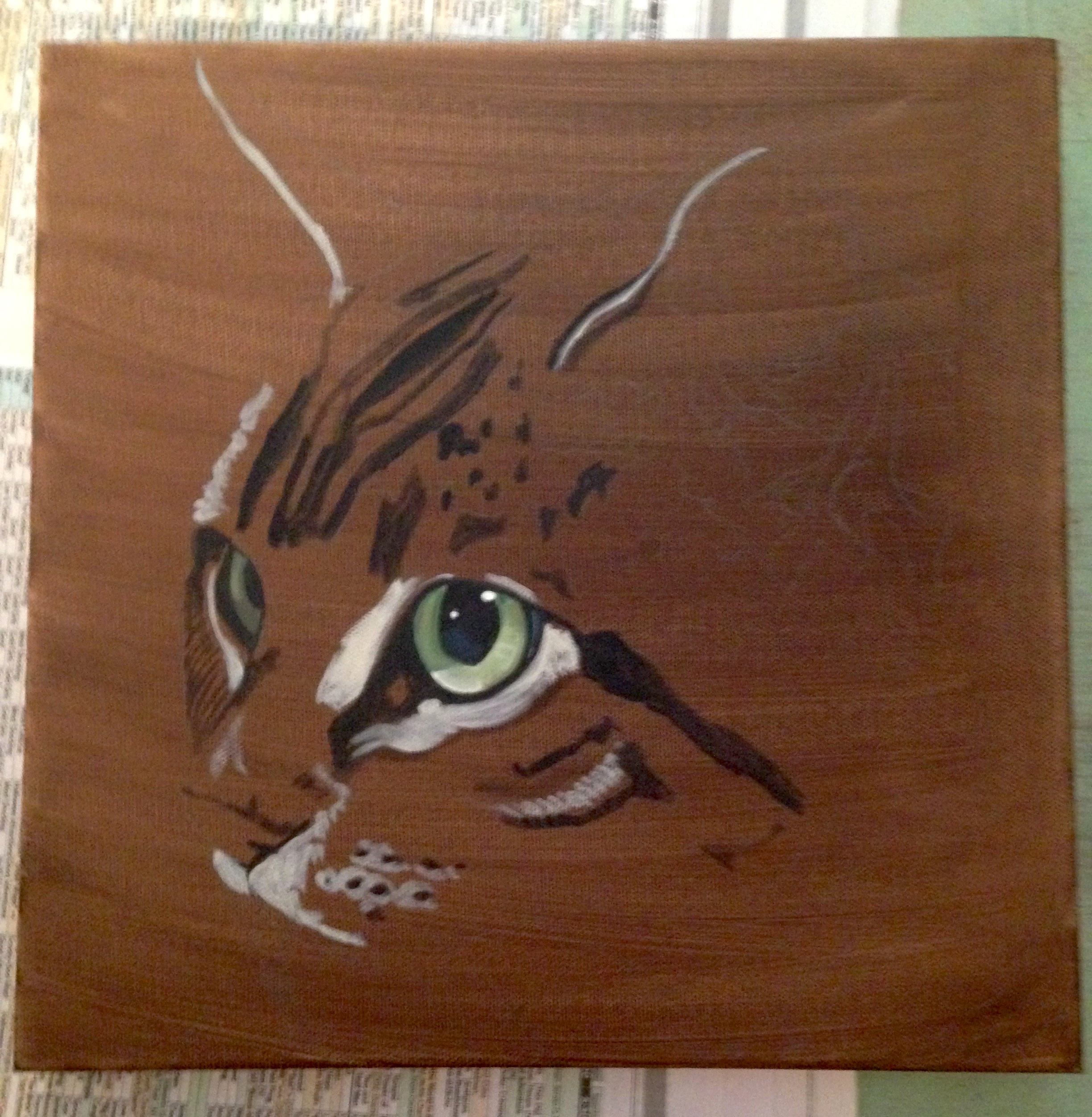
12″ x 12″ oil on canvas
I did an underpainting of brown, as when working on a white canvas the surface is always brighter then the colors being applied to that surface. Since I always start with the eyes and a cats’s eyes are very reflective and translucent, painting them on a dark background helps to gauge the light on the eyes. Once I have completed the painting, most of if not all of the brown background will be painted over.

12″ x 12″ oil on canvas
At this moment, this is where I’m at. Still blocking darks & lights to make up the fur patterns, this also defines the form of the head/face. I’m working from a very clear, sharp photo, which is great as it allows me to be more accurate and cuts down on having to do guess work.
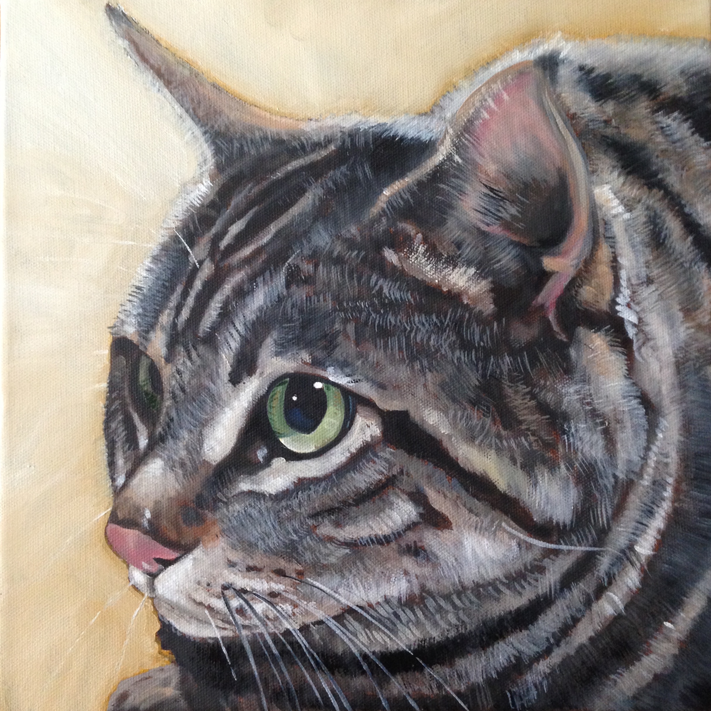
12″ x 12″ oil on canvas
This is the final version. Funny how it looks so much brighter with all that background painter over, right? But once a drastic value change is made a lot of the high-lights had to be adjusted and or added. And of course adding the whiskers is always the last thing I do for the most part.
Two Green Bottles
November 6, 2014
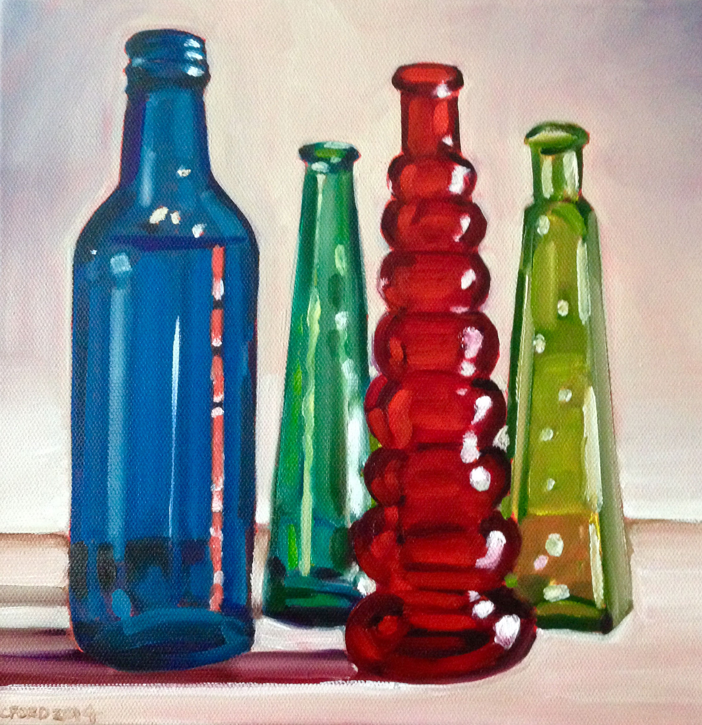
10″ x 10″ oil on canvas – SOLD
In keeping with the glass bottle theme, here’s a red, green and blue image. The two green bottles were two different shades, on a green with more blue and the other with more yellow. With these, I’m trying to keep the refections somewhat simplified with “over-thinking” all the various nuances yet I still want to maintain an accuracy to the object that is true. It was interesting that the light passing thru the red bottled formed this fairly straight vertical red reflection on the blue bottle. This is available for purchase at http://www.atlantaartistcollective.org.
Jesse
November 3, 2014

12″ x 12″ pencil sketch

unfinished version

12″ x 12″ oil on canvas
I’ve gone ahead and placed this portrait in a sequence from top to bottom showing the development of this piece. Granted there probably should have been a more drastically less finished version for the second image, but I kind of got in “the zone” while I was painting and once I got to a stopping point I realized I should have taken a photo earlier in the process. So you get to see some of the nuanced blending, adjusting the color of the background to get a more desirable contrast and adding the whiskers (always the last or one of the last things I paint in pet portraits).
One Fourth Green
October 26, 2014
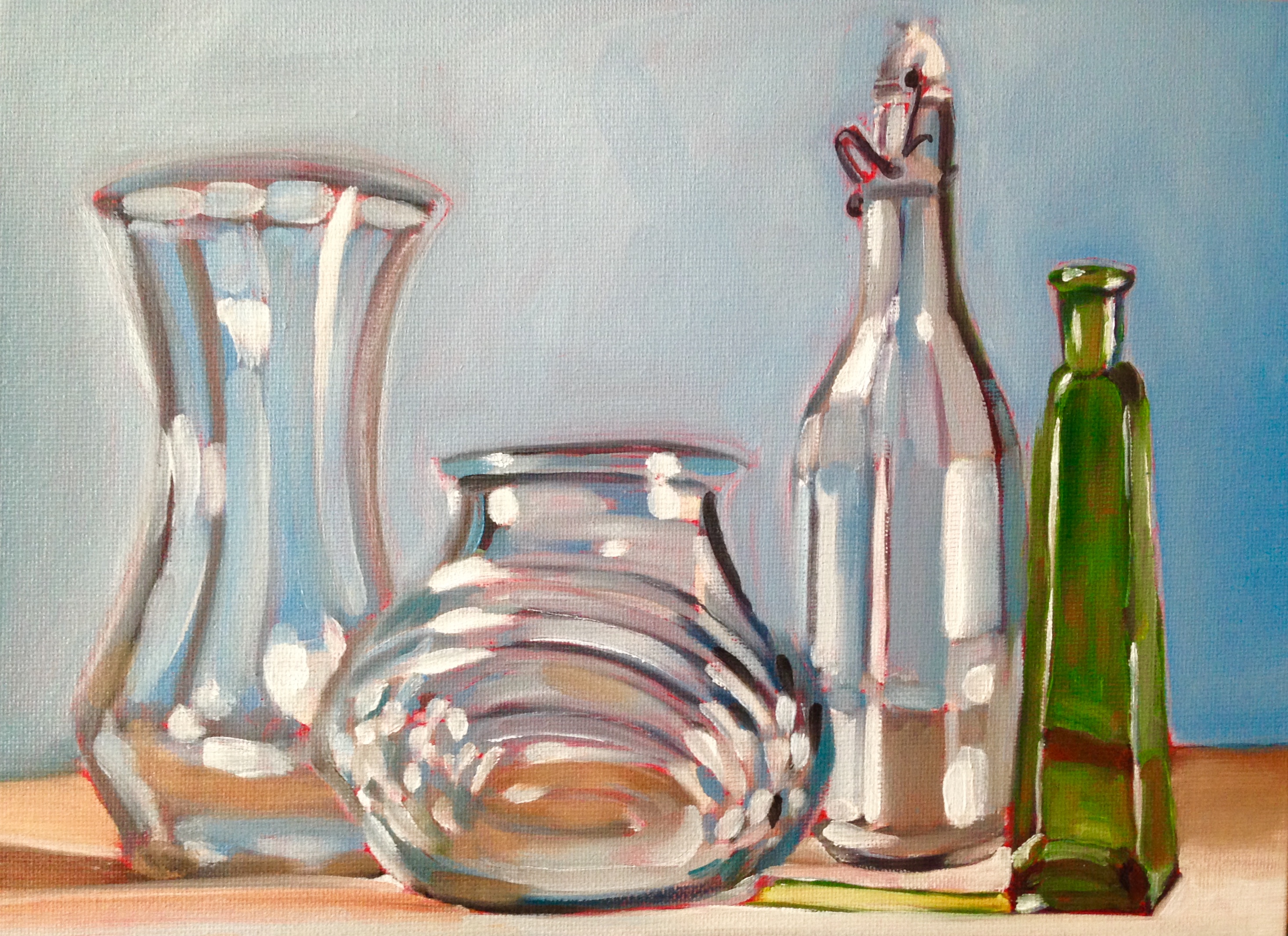
12″ x 9″ oil on canvas board, SOLD
Another still life that is almost monochromatic save the green bottle and some ambient color from the background. This is really about shapes and the light reflections that give form to them. This should be available for purchase in November at http://www.atlantaartistcollective.org. If not and you are interested in purchasing it, contact me directly.
Yellow lights
October 10, 2014

8″ x 8″ oil painting
Think I got the light bulbs out of my system for the time being. These are slightly more painterly then the red lights done a little earlier but not as painterly as the set done before those. Makes sense right? This is available for purchase at http://www.atlantaartistcollective.org.
Still Life #18
October 9, 2014
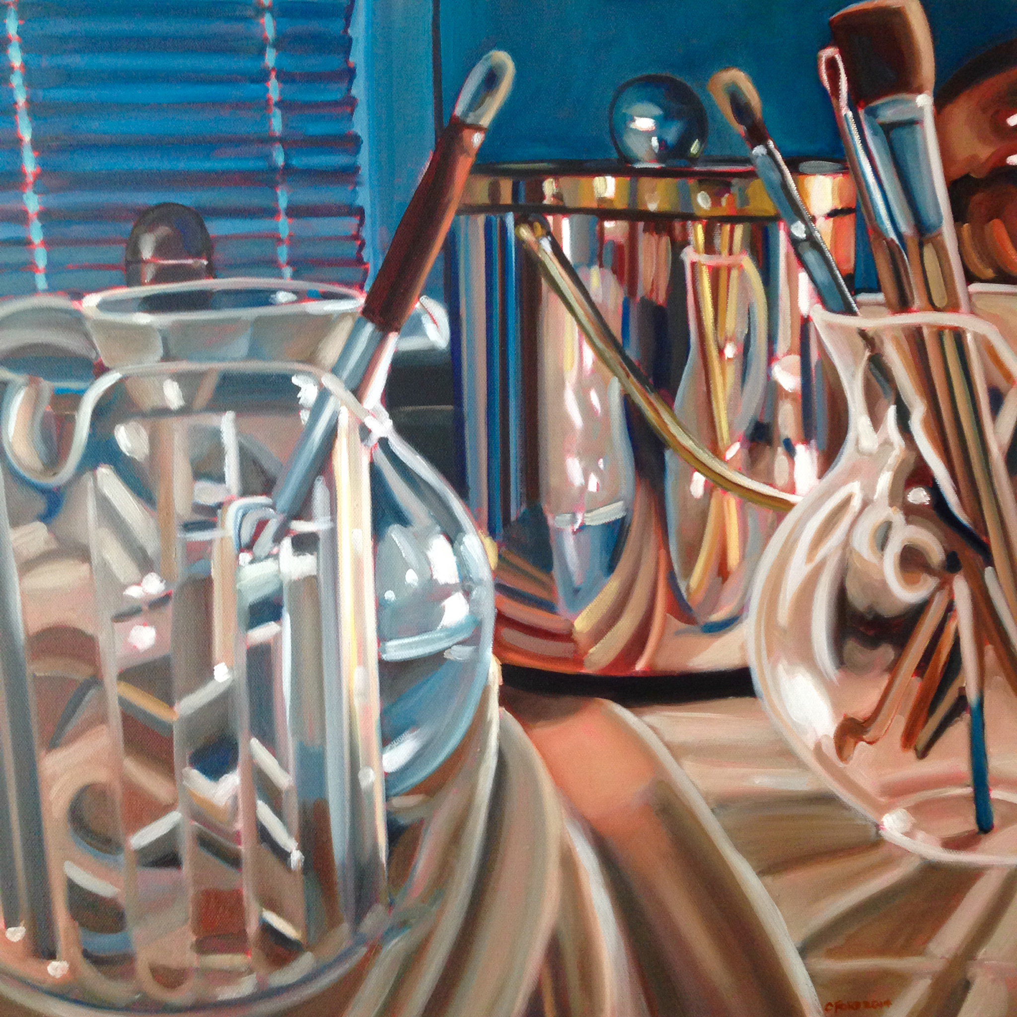
20″ x 20″ oil painting SOLD
This latest painting Still Life #10 & #13, but it is different with slightly altered lighting and color. I think I like this view best as the reflection of images in the metal ice bucket and the refraction of images in the segmented pitcher create an abstracted image. Ordinary objects given a very different look and viewed in a way not normally associated with.
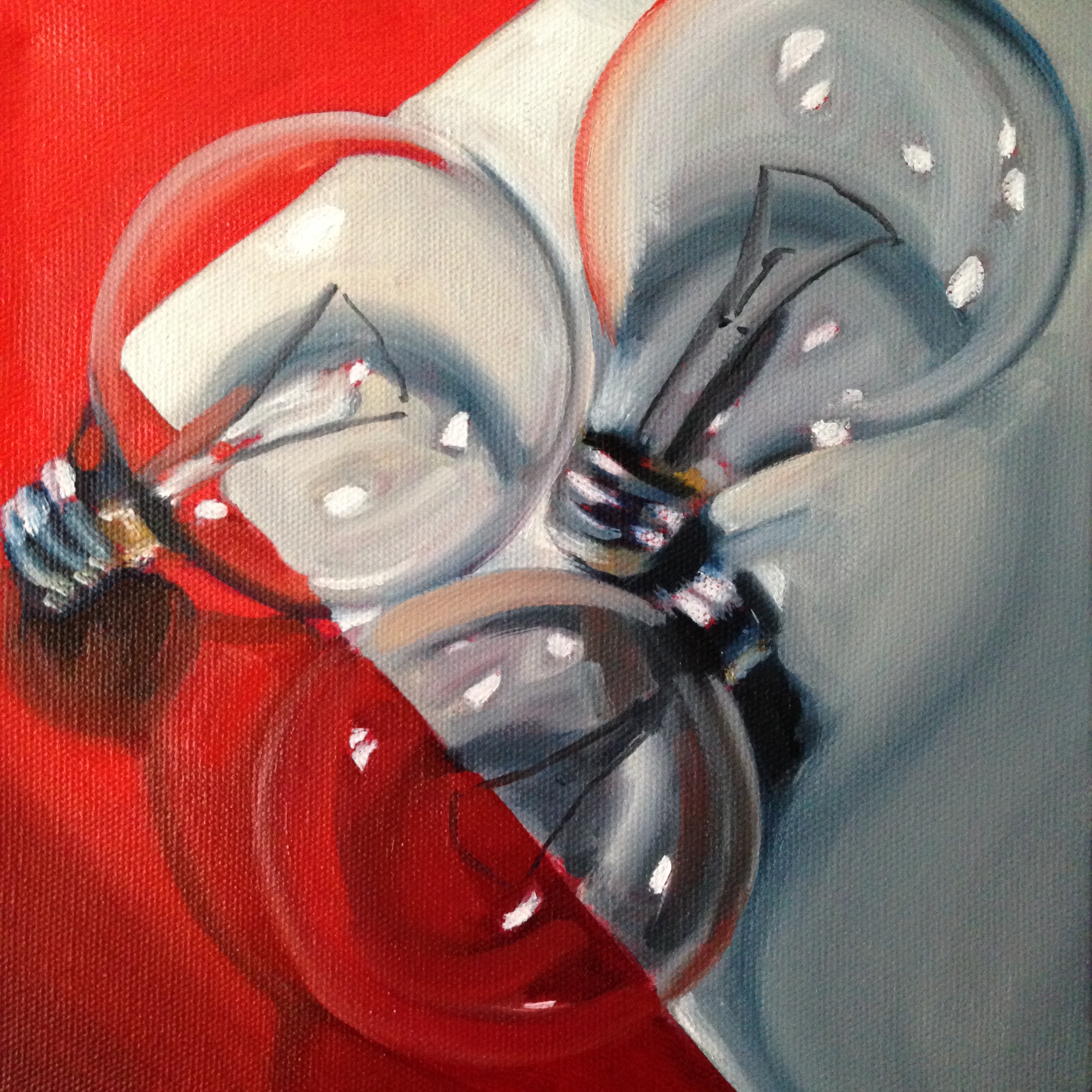
Red lights
September 30, 2014
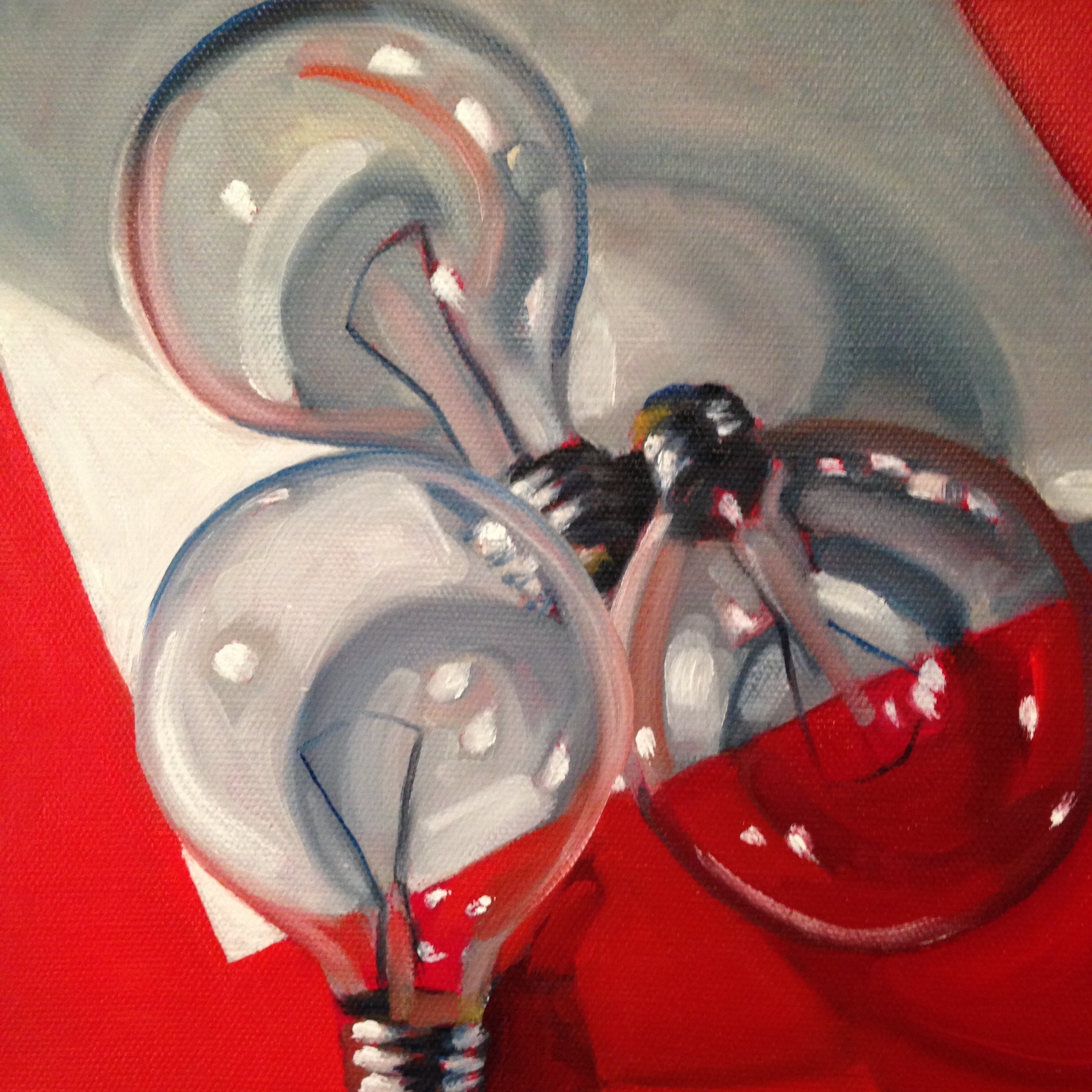
8″ x 8″ oil on canvas, SOLD

8″ x 8″ oil on canvas, SOLD
8″ x 8″ oil on canvas, SOLD
A new little mini-series of clear lightbulbs on a red surface. Adding colors to items with little to no color. This is available for purchase at http://www.atlantaartistcollective.org.
