Craig Ford’s Fine-Art Blog
A multi-disciplinary, pop-art post-modern artist
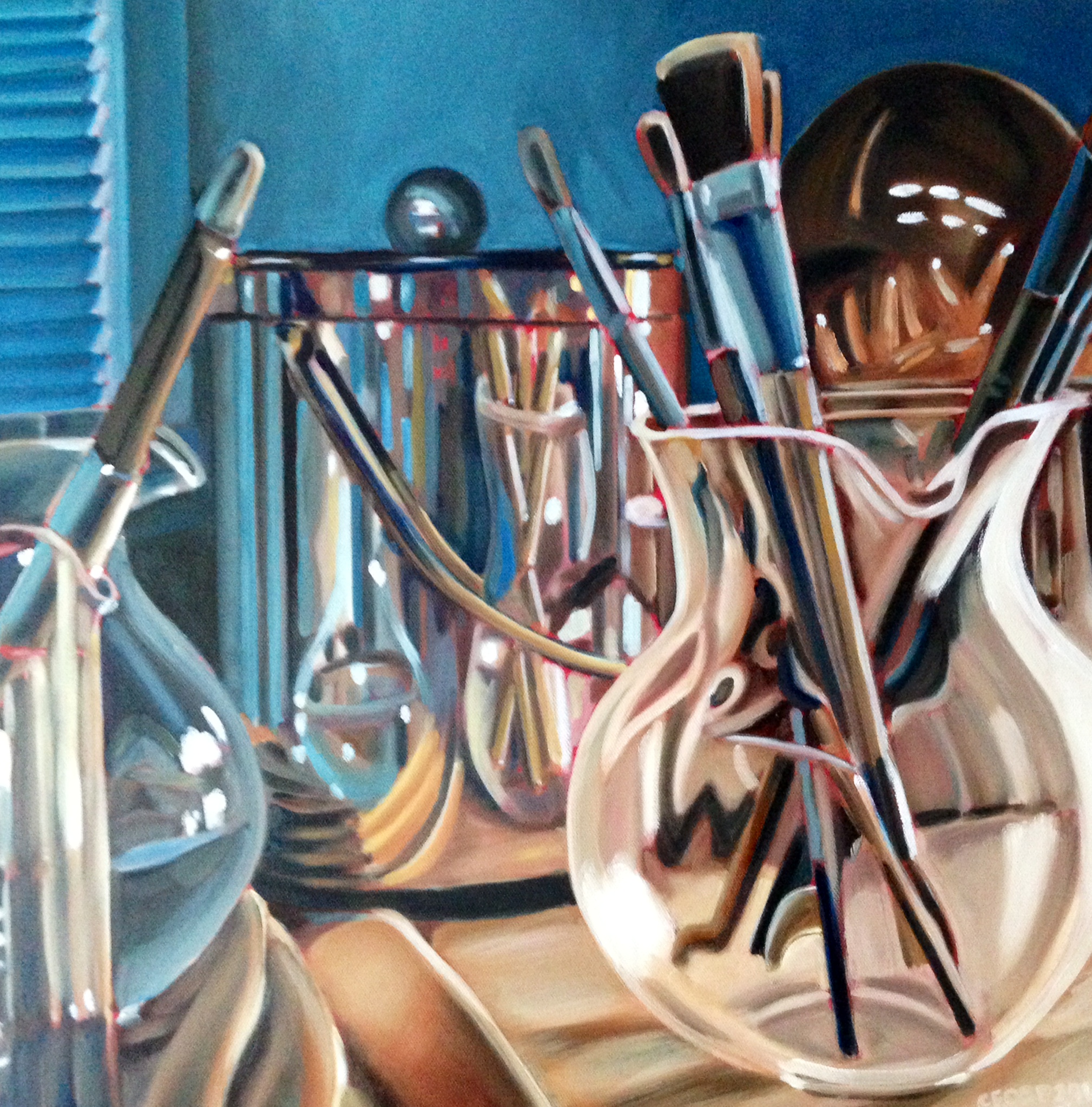
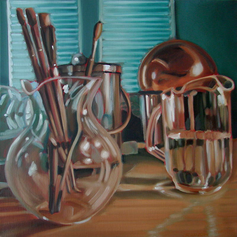
Still Life #12
June 19, 2014

20″x 20″ Oil on Canvas
This particular pitcher has been a bit difficult to paint, especially when I first started this series. Because of all the refracting flat segments that make up the cylindric sides, the reflections change every time you look at it. Because your head and eyes never return to the same exact place when you glance away. So you fine yourself having to create a caricature or stylized rendering of what this pitcher looks like the majority of the time when you look at it. And after painting it a few times, you start to see how the color and shapes create the suggestion of your fleeting glimpse. That and I wanted this one to have some sparkle to it.
http://www.AtlantaArtistCollective.org
Still Life #11
June 6, 2014
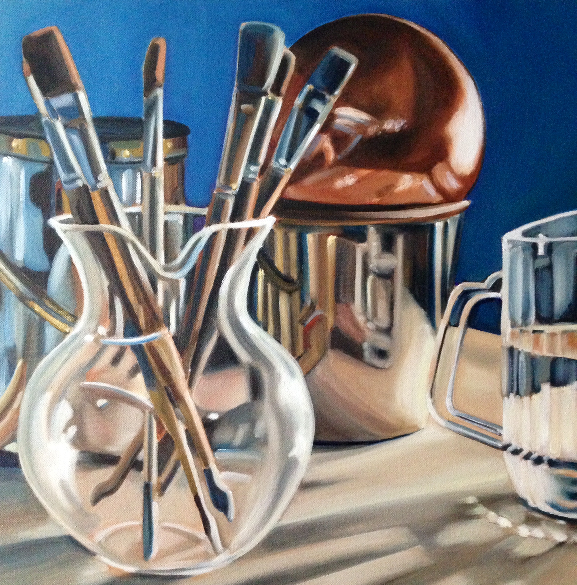
20″x 20″ oil on canvas
Continuing with my study of transparent and reflective objects as a still life subject, this is another take in this series.
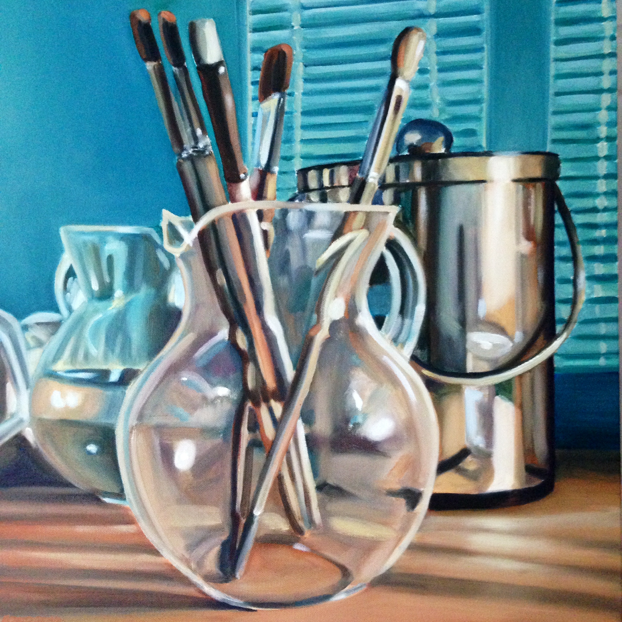
Still Life #10
May 23, 2014
20″x20″ oil on canvas
This is another in my current still life series, this one has a red underpainting that “peeks” thought in various places. I like the unusual distortion and subsequent abstract shapes I get from the refraction and reflections of the shinny surfaces.
I sort of feel like I should be commenting more on these but this series kind of speaks for themselves. The interplay of shape and light is really my concern doing these. And the distortion of the paint brushes in the pitcher is always a lot of fun to paint.
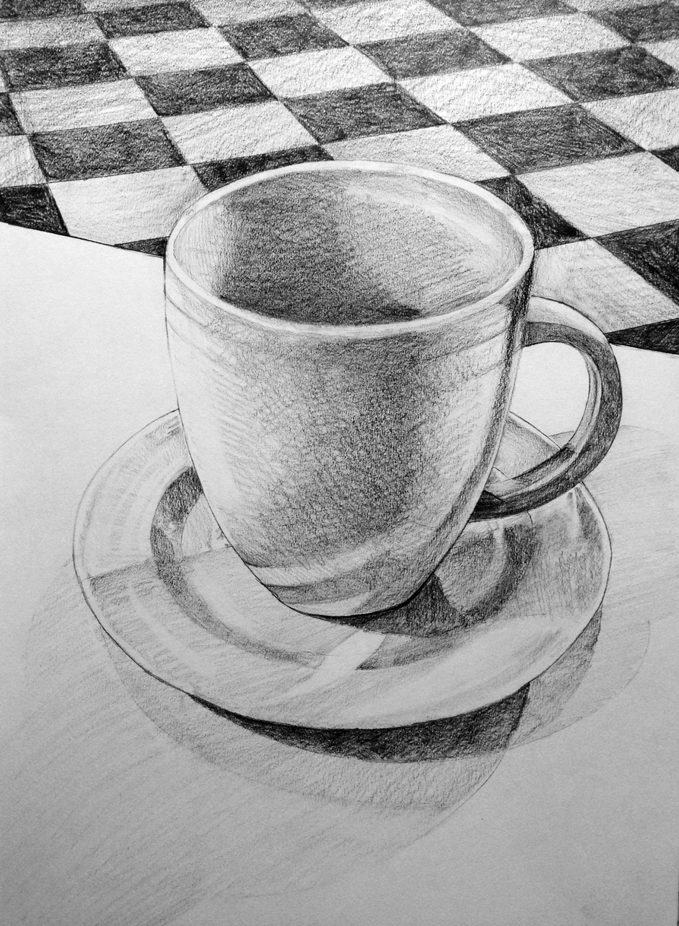
Alice’s Tea Cup, a color study
May 17, 2014
I’ve been reading a book on the artist Wayne Thiebaud and since I am on a still life kick at the moment, I have really taken to Thiebaud’s use of light and color. One thing Thiebaud talks about is his tendency to stylize shadows (he refers to this technique as a caricature). I’ve had this notion in the back of my mind as I sketched this version of the tea cup, which I originally drew in pencil a few weeks ago seen here on this blog, using acrylic paint instead of my usual oil set. I find that I have to work faster with the acrylics since they tend to dry much faster which is good in that I don’t worry so much about accuracy so much as just trying to get an image down. I may do some additional studies and play with the colors more before executing an oil version since this goes pretty quickly. I think my writing on this entry is quick and a bit sloppy too, oh well, have to make more of an effort next time.
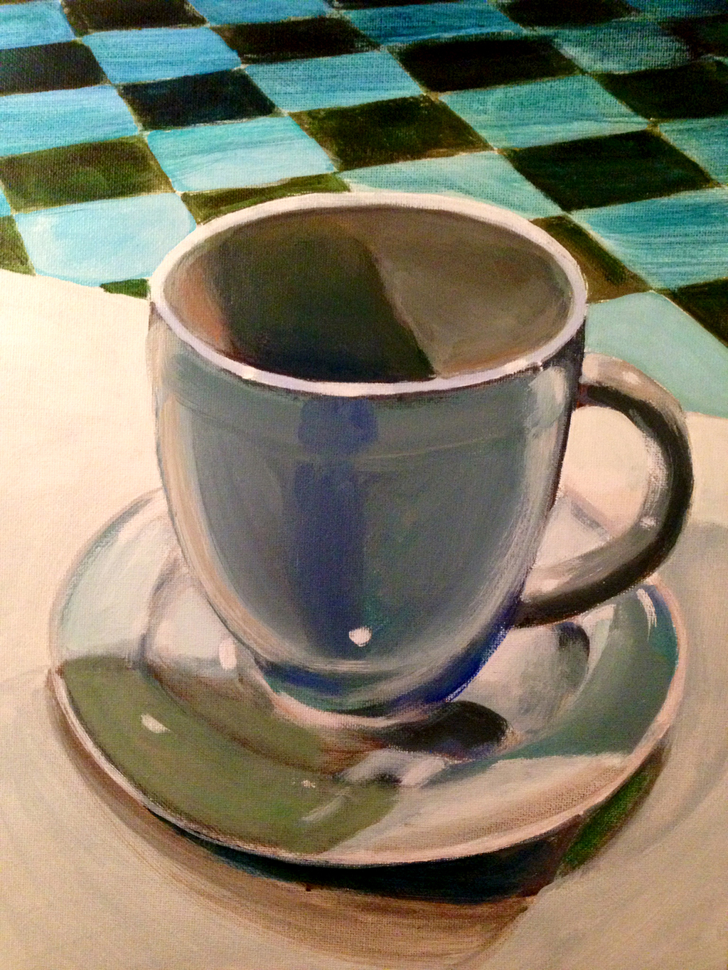
12″x 16″ acrylic on canvas
Still life #9
May 10, 2014

20″ x 20″ oil painting
For this outing, I placed the still life between me and the source of light. Which made this painting a little trickier then most that I have done so far. The blues and greens in the shadows were slightly exaggerated but tie in the background and foreground. I also did a deep red underpainting, that creeps through in several places for a nice colorful effect. I have a few more of these to do before I’m done with this series.
Still Life #8
April 28, 2014
20″ x 20″ oil painting SOLD
Here’s another oil painting of shinny and translucent objects. My current kick on painting not only those objects but the often strange shapes reflected and or refracted on them and through them. So far these have been easier to produce then the larger 36″ x 36″ canvases, no doubt that its about a quarter of the surface area so it can be painted in less time. Not that speed is what matters, just after a few years working on larger surfaces and coming to expect a certain time frame to complete one, then to work on a smaller canvas I surprised myself when I finished one of these sooner then expected. Good lord this is starting to ramble on. How you like this one, leave me a comment and let me know what you think.
And now a little graphite…
April 26, 2014
Had an opportunity to take a drawing class recently, wasn’t sure what would be involved but since I hadn’t had a actual drawing class in many years I thought why not. So an object is placed in front of you and you are expected to draw it as realistically as possible within the confine of class time. So these are far from perfect but I wasn’t too disappointed in the end results. And since I’m on a still life kick at the moment (will have a new oil painting of one shortly), it seemed like a good justification to post these. There are a few more classes to go, so if anything else turns out decent I’ll upload those as well.

pencil drawing on paper – sold
pencil drawing on paper – sold
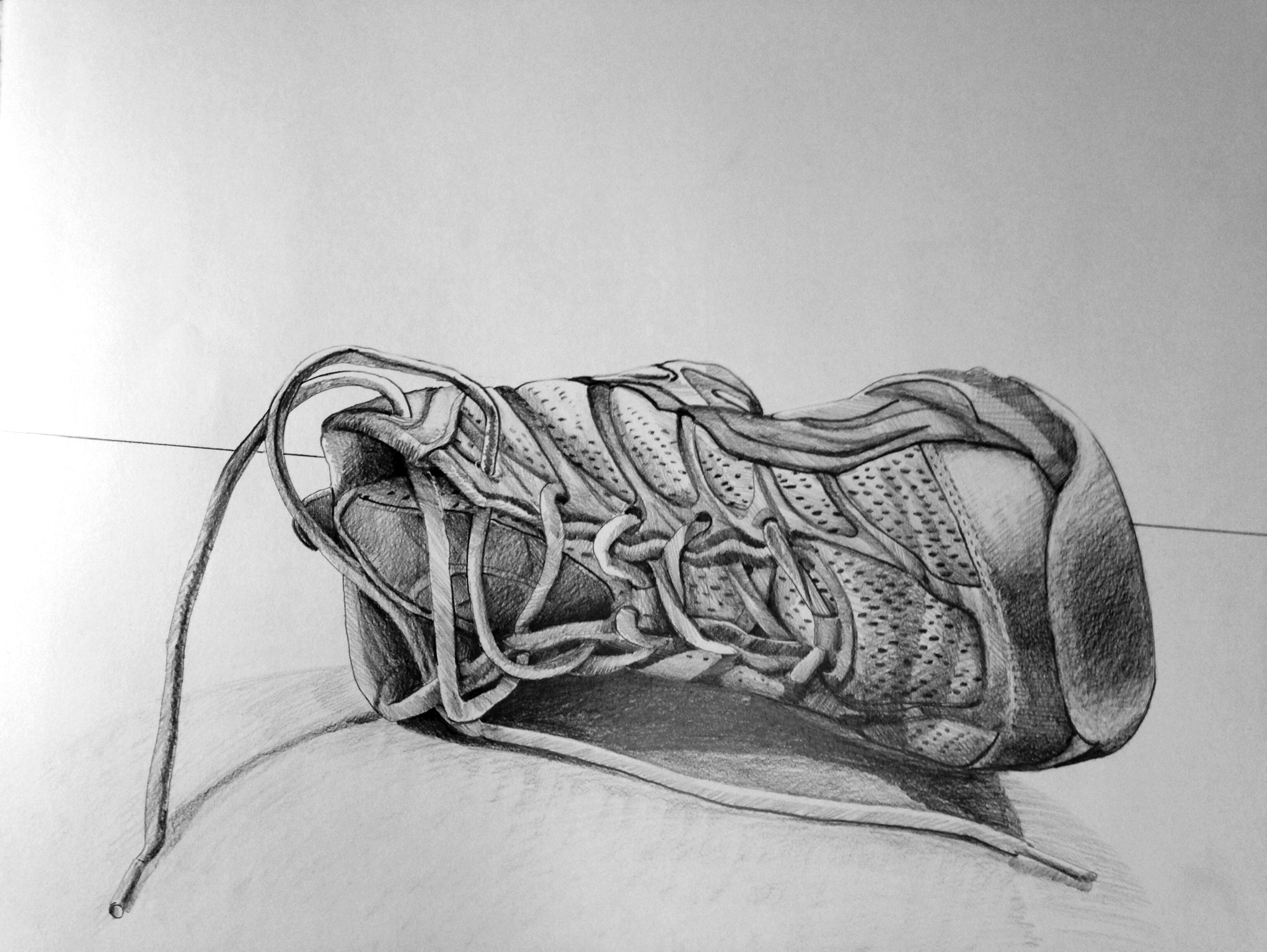
pencil drawing on paper
Queequeg’s Junket Series – Kate
April 26, 2014

part of Queequeg’s Junket Series
18″ x 18″ oil on canvas
In keeping with the reality-TV personalities that have far exceeded their “15 minutes”, here is the second in a series that may or may not ever be completed. Mostly done for my own personal amusement but thought I’d publish it here as I seriously doubt anyone would really want it hanging in a gallery. I’m not opposed to having it in a gallery, just keeping my expectations low on these.
Still Life #7
Thursday, April 6th 2014

20″ x 20″ oil painting – donated NFS
Here’s the next of my still-life series. The underpainting on this one is a light brown, I had some “yellow” white lights at the right with a blue cast coming from windows off the the left.
Still Life #6
March 31, 2014
20″ x 20″ oil painting
Continuing with the pitcher still life oil paintings, I painted the entire surface in madder red as an under painting before beginning. Hence there are little areas where specs of red show through (parts of the canvas where I either missed covering or it was difficult for the brush I was using was too large to handle a tight space). So you get these interesting places of color emphasis that’s a nice accent. Still trying to keep brush work somewhat loose but I find it tempting to make the images tighter but I think that would diminish the painting’s character. I’ve got a few more to work with before I’ve exhausted this subject. Granted there may be many out there who think I reached that point weeks ago, so leave me a comment.
